
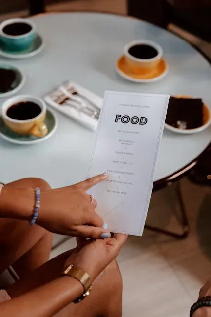
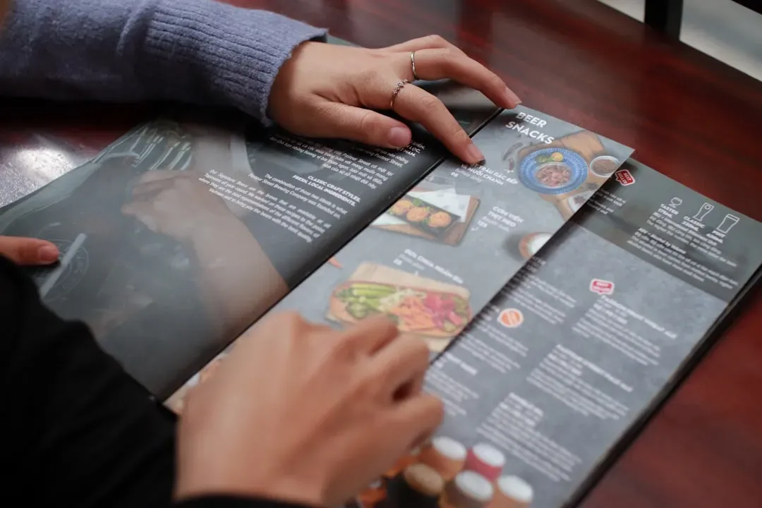
Every time you sit down at a restaurant and open a menu, you think you’re in control. You’re choosing what you want, right? Honestly, it’s not quite that simple. What you actually end up ordering is often the result of a carefully constructed set of psychological nudges, visual cues, and behavioral triggers – none of which you consciously noticed.
Restaurants have spent decades studying human psychology, and their menus are the result of that research. From where a dish sits on the page to what music is playing in the background, every element is designed with purpose. The rabbit hole goes deeper than most people ever realize. Let’s dive in.
Table of Contents
1. The “Golden Triangle” – Your Eyes Are Being Led
Here’s the thing most diners never think about: your eyes do not scan a menu the way you read a book. A common eye movement trick is called the “golden triangle,” a rule that says most guests will focus first on the center of the page, and then move their attention in a triangle, first to the top right, then to the top left. Restaurants use this predictable reading pattern as a map to place their most profitable items directly in your field of vision.
This golden triangle is the area where restaurants position the least complex, best-tasting, or most profitable dishes on the menu. Guests will also be drawn to either the top two or the bottom two dishes in any section of the menu, so star dishes are placed in those prime spots. It’s not random. It’s engineered.
Boxes and icons draw instant notice, making them perfect for high-margin or signature offerings. Too much clustering in a single area can overwhelm readers, so spreading out star items across multiple sections can improve overall sales. Think of it like a visual treasure map, except you’re the one being hunted.
Research shows that customers are likely to order one of the first items that draw their attention. Since guests only spend an average of 109 seconds looking at a menu, it must be designed for guests to easily find key items. Just over a minute and a half. That’s all the time a restaurant needs to steer your decision.
2. The Dollar Sign Disappears – And So Does Your Spending Caution
Look closely at an upscale menu. You might notice the prices listed as “28” instead of “$28.00.” That tiny change is not an accident. One of the subtlest tricks in upscale menu design is the removal of the currency symbol entirely. Instead of “$42,” the menu reads simply “42.” Research from Cornell’s Center for Hospitality Research demonstrated that diners who were shown menus without dollar signs spent significantly more than those who saw prices with the symbol.
When we see a currency symbol like the dollar sign, it immediately activates the pain centers in our brain associated with loss and payment. This “pain of paying” is a well-documented psychological response that serves as a spending inhibitor. Remove that symbol, and the inhibitor weakens.
Menus without overt references to money yield an average of $5.55 more in spending than menus with prices printed with either a dollar sign or written in script. Based on average check and party sizes, this increase translates to an approximately 8% increase in average spending per person. That may not sound huge, but multiplied across hundreds of tables every week, it adds up fast.
3. Price Anchoring – Making the Expensive Feel Reasonable
Ever noticed an absurdly priced item near the top of a menu? A $90 wagyu steak, or a thousand-dollar specialty dish? You probably didn’t order it. You were never meant to. Listing a premium item at the top of a section sets a mental benchmark. When guests see a $24 entrée first, the $16 dish below it feels like a better value, even if it wasn’t part of their original budget. This is price anchoring, or decoy pricing, in action.
For example, if you see a $32 steak on a menu next to a $22 chicken dish, the latter will appear to be a good value for money, even though it might not be the cheapest option overall. The frame of reference has been set for you, without your awareness.
The high-priced item is a decoy – an anchor that recalibrates your internal sense of what is “reasonable” to spend. After seeing the high anchor, spending $42 feels restrained and sensible, even if you walked in expecting to spend $28. It’s one of the most quietly powerful tricks in the restaurant playbook.
4. Descriptive Language – You Taste What You’re Told
There is a meaningful difference between “grilled chicken” and “slow-roasted, herb-marinated free-range chicken with a sun-dried tomato reduction.” The food might be identical. The experience of ordering it, however, is not. Writing longer, more detailed descriptions persuades customers they are getting more for their dollar. According to a Cornell study, researchers found that more detailed descriptions sold nearly 30 percent more food. Customers also rated those items as tasting better.
Descriptive language can significantly boost the perceived value of dishes. By painting a vivid picture of the taste, texture, and presentation, it helps stir a customer’s imagination and stimulate their appetite, potentially boosting sales. The description itself becomes part of the dish.
Telling a story works. Detailing dishes with language that describes where the ingredient is sourced and how it’s prepared is effective in increasing the perception of quality. You’re not just reading a menu at that point. You’re being sold a fantasy, one delicious sentence at a time.
5. The Paradox of Choice – Fewer Options, More Spending
More options should mean more freedom, right? In theory, yes. In practice, too many choices paralyze us. The psychological theory known as the “paradox of choice” assumes that the more options we have, the more anxiety we feel, whereas too few options make consumers feel misrepresented. Restaurants exploit this tension carefully.
The golden number for food options is seven per category. Anything over seven items can overwhelm customers and lead to confusion, and confusion can cause them to revert to their “usual” by default instead of trying a new menu item. Fewer options equals less anxiety, which means a more relaxed diner who is willing to try something new – or something more expensive.
Most restaurants improve profits by 2 to 10 percent from a reengineered menu, according to Restaurants USA. A big part of that reengineering is simply cutting the menu down and letting the remaining items shine. Less truly can be more when someone else is designing the choices for you.
6. Color Psychology – Red Makes You Hungry
The colors on a restaurant menu are rarely chosen for aesthetic reasons alone. They are chosen to trigger specific emotional and physical responses. Certain colors, such as red, orange, and yellow, can stimulate appetite and make customers more likely to order food. These colors are often used in fast-food chains, where speed and hunger are priorities.
Green implies the food is fresh, and orange stimulates the appetite. Yellow is a happy hue and is used to catch the diner’s attention. These are not random design choices. Color associations are deeply wired into human perception, and restaurants know how to pull those psychological levers.
Bright colors, like red, yellow, and orange, have been shown to trigger appetite. Incorporating these colors into a menu could encourage hungry guests to order appetizers before their entrees. Meanwhile, fine dining establishments often opt for muted, neutral tones – signaling calm, quality, and the confidence to slow down and spend more. Two completely different color strategies, both working on you simultaneously.
7. Background Music – Your Spending Dances to the Beat
You probably never connect the music playing at a restaurant with how much you end up spending. That’s precisely the point. A 2024 study published in Frontiers in Psychology found that background music significantly influences how long guests remain seated, how much they spend, and how generous they are with tips.
Slow music led customers to spend more time in the restaurant and to spend more money on alcohol. Research also found that slow music led to more spending on food and beverages overall. The tempo quite literally controls the pace of your meal and the size of your bill.
Experts from the University of South Florida revealed that music volume has a direct influence on consumer food orders. Loud music causes diners to take unhealthy dishes such as fries and burgers, since the volume of songs increases heartbeat and stimulation. Calm, quiet music contributes to a relaxed mood, making people more focused and mindful about food orders. And if you think classical music is just elegant atmosphere, think again. Research found that customers tended to purchase more expensive wines when classical music was played.
8. The “Extremeness Aversion” – Why You Always Pick the Middle
Think back to the last time you ordered wine at a restaurant. Did you pick the cheapest bottle? Almost certainly not. Did you order the most expensive? Probably not that either. Most customers have an extremeness aversion – they’ll never order the most expensive or least expensive items on the menu. Restaurants can use this psychological quirk to their advantage.
Offering a “basic,” “deluxe,” and “premium” version of a dish can encourage customers to choose the middle option, which may be the most profitable for the restaurant. This three-tier structure is not about giving you variety. It’s about herding you toward the option they want you to choose. The choice feels free. It isn’t.
Guests are more likely to say yes to upgrades and extras when those options are part of the natural ordering flow, not buried in a separate section. This subtle form of psychological pricing works especially well when the extra cost feels low relative to the base price, like one dollar to add bacon or two dollars to upgrade fries. Small additions, anchored against a higher baseline, barely register as spending at all.
The next time you sit down at a restaurant and open that menu, you might want to pause before you order. The dish you “chose” may have been chosen for you long before you ever walked through the door. What’s more surprising – that restaurants use all of this psychology, or that it works so well on nearly all of us? What do you think? Tell us in the comments.